How to make a visually appealing resume
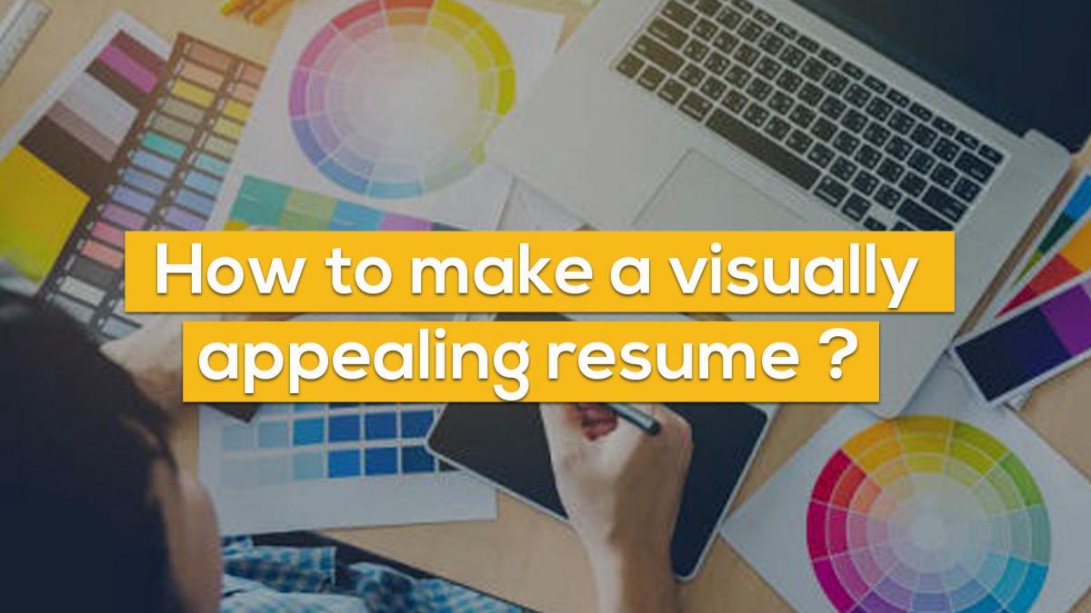
Appearances might be deceiving, but this is not the case with a visual CV. Even if you already have a compelling output, good aesthetics can help you take your CV to the next level.
However, don't go overboard with the visuals, as beautiful charts, graphics, and logos on resumes can often be lost in an ATS scanner.
Here are five tips for improving the aesthetic appeal of your resume.
Since Visual CVs are submitted electronically, utilising colour and shading to highlight important elements of your resume can help you stand out. But, bear in mind not to go excessive while employing colours. Try to use colours that are pleasing to the eye; maintaining consistency in colour and tone will make it easier for the reader to read your CV.
The usage of a bold typeface in your Visual CV makes it easier for the interviewer to skim through it. But ensure that this style of typography is used consistently; too much or too little highlighting will not help your profile stand out. It is well effective in emphasizing your field of experience. Furthermore, you can also use it to emphasis your achievements.
For example:
DFZ Company, January 2000 to Present
Delivered 100% of quota ranking in top 5% out of 86 peers
A CV is solely composed of text. Thus, when symbols or numeric are included, they tend to pop out on the resume, and makes it easier for the reader to navigate through. As our eyes tend to read a word letter by letter it is always recommended to display numbers as 1, 2, 3, et as reading digits is easier than reading sentences.
These minute details will add up to your already compelling CV and make it a visually appealing document that would help in impressing your future employer.
Add Comments
Your email address will not be published. Required fields are marked *
Categories
Recent Posts
 How To Choose An Executive Resume Writing Service In India
 Revolutionizing Job Applications: The Power of Mobile Resume Creators and Professional Resume Writing Services
 Master the Indian Job Market 2024: Secure Your Dream Job with Visual CVs
 Layoff | Sarah's Story
 Stand Out with Personal Branding in Your Job Search and Resumes
 What's the Best Way to Get Your Resume Noticed? Your Resume Upsets Recruiters: Insights from Hiring Managers
 7 Smart Things to Say in Your Job Interview
 Stand Out in a Visual World: Professional Resume Writing for Creative Professionals
 Creating Visual Excellence: The Art of Resume Writing for Finance Professionals
 Networking: Your Pathway to Professional Success and an Outstanding Resume


